
The Busy Bee
Too busy to plan other activities when on vacation but still looking forward to having fun with the kids
Scenario
Wants to go on a vacation with her husband and 2 kids to London for a week, but she is worried and concerned about how difficult it is to get an affordable hotel in a great location that has close proximity to outdoor activities that would engage the kids.
Personality
Prioritizes happiness and well-being of her family.
Always aims to create lasting memories with her kids.
User Goals
To plan a family vacation that will be both enjoyable and educational for her kids.
She is looking for a hotel that offers outdoor activities and is close to local attractions.
Pain Points
She is often limited by her budget and has to balance the cost of the vacation with the activities and experiences she wants to provide for her family.
Age: 35
Occupation: Accountant
Status: Married with two kids


Q1: How often do you use Hotel booking apps?
Q2: Which is your preferred and why?
Q3: What's your goal for booking?
Q4: What was your experience like using the app?
Q5: What is one thing you liked about the application?
Q6: When booking a hotel with family, what things would you consider?
Q7: Are there challenges you face when booking?
Q8: Which hotel app would you recommend to others and why?
Q9: Describe one of your best overall booking experiences.
Q10: What are your most important factors when booking a hotel?
The second step in my research was to have a look at other hotel booking apps. I reviewed four apps, Hotels.com, booking.com, Airbnb, and family critic vacation. I chose to do these four as they were the top results when I was searching for hotels on the app store.
I wanted to look at the most popular hotel booking apps as I thought they would be the best at solving already existing user problems and are best designed for a good user experience.
The Goal
To see how popular hotel booking apps solve problems that I wanted to solve.
How I can use any negative experiences as a way to improve my app and not repeat the same issues?
To figure out the conventions of the hotel apps and how they differ across different apps.
My Focus
My focus was mainly on the following screens:
1. Home page - what comes up first as the user opens the app
2. Select Page - the layout of the selection process, what was put at the top, features, etc
3. Result page- Key features used on the result page and why.
Competitive Benchmarking

Empathize
Market Research
Online Survey
Competitive Benchmark
Usability Test
Define
Affinity Diagram
Customer Journey Map
User Archetype
Ideate
Flow Diagram
Sketch Screen State
Prototype
Wire frame
Hi-Fi Design
Prototype
Test
Usability Testing
Feedback

Tools Used
Work Process

Scope of Work
Empathize Phase
Market Research
My first step was to carry out market research to get to know more about the hotel booking app, the nature of the product, and its competitors. Using google search, google play store, and the apple app store, I found some direct and indirect competitors.
Direct competitors: Airbnb, booking.com, hotels.com, travago
Indirect competitors: Family Critic Vacation, Tripit, Gowhee,

From this research, I was able to pick up on the typical conventions and best practices that hotel apps use:
Observations
Explore/recommendations of places to visit is a good feature
The search bar is usually the first thing on a homepage
Map View/list view option is available
Filters/sort to make the search easier
Share, like button on hotel pages
User-friendly interface
Negative Interactions
Pop-up ads that showed up as you entered the app.
Sign-up notifications without completing the booking process.
However, these apps did have a user-friendly interface for me, they displayed all the relevant information and I was easily able to select dates for my stay. Out of the three apps, I preferred Airbnb as the interface was very well designed and the booking process was much faster and simpler than the other two apps.
Summary / Observations
Interviews & Online Survey
In order to gain insight into how users are experiencing similar products, I needed to collect feedback to help make sense of user behaviour and to learn what works and what doesn’t so I can prioritize the changes I carried out on my one-on-one interviews.
I created an interview script and interviewed my friends, colleagues, and family members who always booked hotels for various reasons and traveled frequently. I did interviews over video calls and phone calls by using zoom, Whatsapp, and google duo platforms. In total there were 9 participants with whom I got an opportunity to talk and gather some insight into their challenges and motivations.
Here are some of the questions;
Positive Interactions
Reviews and ratings of the hotels were useful for users to complete a booking.
Location and surrounding structures were strongly considered when booking.
Proximity to the city, malls, and shopping areas was important to the user.
When booking with family, space and nearby activities was important.
Pain Points
Lack of spacious rooms when with family.
Traveling with family is worthwhile when the kids are engaged in outdoor activities.
Inaccurate or misleading information.
Limited search options.
To deepen my research, I wanted to look into the personal experiences of people who have used any booking apps, their goals, behaviors, and context.
So I did an online survey using Google forms to observe any patterns and similarities in what the potential user may want. A total of 20 people responded to the survey which helped me frame the problem correctly.
Doing an online survey made me understand the main pain points users face when trying to book a hotel through an app. From my research, I can see that well-presented images of hotels and hotel rooms were a recurring pain point for users. Also having reviews and ratings of hotels was a key part of decision-making for users, therefore I knew that this was something I could not leave out when making my app.
Furthermore, this showed that it can be very easy for a user to turn away from an app and not use it again if they face a single negative thing. From the app not being responsive to having too many ads or unnecessary additions to the UI design can put off users. This made me want to opt for a design that’s not going to have too much going on, but at the same time not too minimal.
60% of users had something to change about the app due to their negative experiences.
50% of users found certain features of the app useful in their hotel booking process.
30% weren’t able to complete their booking because of difficulties using the app.
30% would change the UI design on the app for a better experience.
This usability test brought quite a few things to my attention. I can see how simple additions to an app can make a pleasant experience for the user. For instance,
User Perspectives
I got to observe the user's bahavour and emotions as they interact with the product.
Validate previous assumptions, like features that were a good experience for one user can be a pain point for another user.
Some Design Goals to consider.
Adding a map view was a pleasant experience for the user.
Giving the user the ability to change currency was very important.
Users were really pleased when welcomed with a beautiful image on the landing page. In his own words, it really sets the mood.
Don't give users too many options, it can be frustrating.
Being able to see nearby fun activities was a good touch.
Add reviews and descriptions to hotel bookings

Quantitative Research

Summary / Insights
Project & Diploma Duration
6 Months / 18 screens
Summary / Insights
Usability Testing
The next part of my research was to conduct my own usability test. In other to challenge or validate my assumptions I needed to watch and observe how people are using existing hotel booking apps, their behavours, and their feelings. I conducted a usability test on two participants and observed their interactions and honest feedback using three native apps, Airbnb, Travago, and Booking.com.
My usability test took place in person - a camera was set up, the phone screen was being recorded and I was doing the note-taking.
I created a script to keep me in line with what to ask my user and what prompts to give to get relevant feedback. My main aim was to ensure that the user felt comfortable enough to communicate whatever thoughts they have, while still staying in line with what I was asking/prompting them to do. As this was in person, I was able to take note of their behavours and any hesitations they were having that they weren’t able to communicate.
We went through the app step by step, starting from the homepage, and ending on the review page. As I was conducting this usability test, I took notes simultaneously and took further notes whilst watching the recordings. This allowed me to make more in-depth notes and pick out anything I might have missed out on before.
Below I have listed a condensed version of my notes
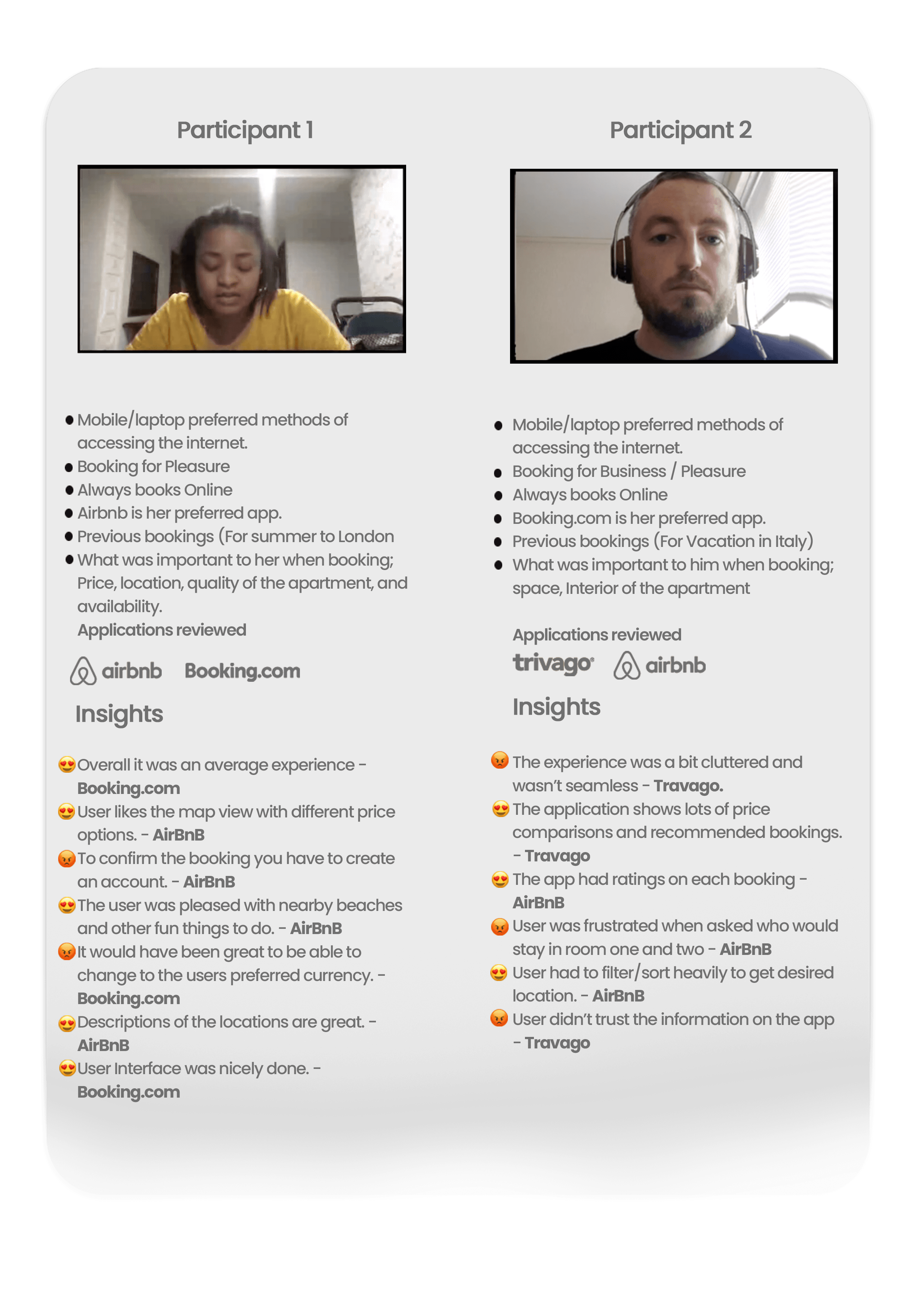
Summary and Insights
Affinity Diagram
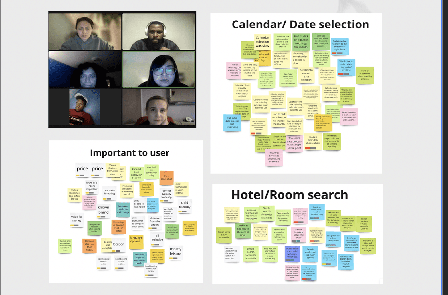
Now that my research has been completed, the next step is to define the problem. To define the problem, I had to gather all my findings and research notes to make sense of them and gain more insights into solving the problem, I collaborated with 5 other colleagues. We started by sharing all our raw data and after an hour we came together to make sense of it all.
We used Miro to create sticky notes of all the findings and group them into appropriate categories.
We decided to categorize the sticky notes into different screens on the app - eg. homepage, results page, search page- as this was how I structured my usability test, and how the usability test I watched was. I then colour-coded the sticky notes so that it represents what notes are negative, positive, behavour, and goals.
Doing an affinity diagram with others was a great way to get a clearer structure of what my research helped me to achieve.
Grouping them chronologically would be useful when it comes to sketching each screen, as I can look back at this diagram and find the right category.
Summary/ Insigths
The Affinity Diagram was able to help me define and make sense of my research, here are some key points
Positives Interactions
Use beautiful images and videos of lovely destinations for the homepage.
always display ratings by Trip Advisor
Arrival and departure date input must happen on one page.
Add a map view during the search to give a sense of proximity.
Include an option to change currency.
Add a little description of the location when presenting the search results.
Use simple and clear icons to make navigation easy.
Provide options for nearby fun activities.
Use appropriate colours with the UI to help tell a story.
Negative Interactions
Avoid pop-up ads on the application
Don't overwhelm the user with search options.
Make sure each page is visually appealing
The user should be able to change currency as desired.
Pay on arrival should be an option.
Refundable payment should be available.
Who are we designing for?
The Tourist
Always looking for fun places and things to do when on vacation.
Scenario
He loves to travel and ensures he has as much fun as possible while on vacation but he is usually bad at planning those extra activities while also considering his budget.
Personality
Adventurous and spontaneous, loves to travel and explore new places.
He is outgoing and loves trying new things.
User Goals
Wants to plan a vacation that is packed with fun and adventure.
He is looking for a hotel that is close to touristy activities and attractions, so he can maximize his time and experience.
Pain Points
He has a busy work schedule and may only have limited time for a vacation.
He may also be working with a tight budget, which can make it challenging to find the right hotel that meets his needs.
Age: 29
Occupation: Lawyer
Status: Single

Customer Journey Map
I then moved on to creating a customer journey map by using the affinity diagram. To analyze deeper into how the user experience was throughout the usability test, I did a visual representation of the steps, emotions and touchpoints my participants went through to further identify pain points and opportunities for improvement.
What I found quite interesting was how the experience was average or below average. It shows a rollercoaster of emotions felt by the users - something that starts off pleasant, gets disrupted in the middle, and only gets better once the booking is made. The most unpleasant part of the journey was the add-ons page, due to users finding it disrupting or difficult to skip past. Add-ons can be useful for some users as they can provide extra packages to enhance their stay, the majority of my research didn’t find the extra step pleasant. There are definitely many areas of improvement in hotel apps, and creating this customer journey map once again made these improvements more apparent for me to work on.
Ideate Phase
The first two steps of this project are complete, and now it’s time to design the solution.
Before I began to design anything, I reflected on what I have learned from my last two stages. Below are the points of improvement and general conventions that I would incorporate when designing:
• Users like a visually appealing and a relevant homepage
• Make the search bar the main focus to get the user to start their search as they enter the app
• Keep taps to a minimum - users shouldn’t have to do a lot to get to their result
• Pictures of hotel and hotel rooms are vital - slideshow format
• Must have TripAdvisor reviews
• Map view
• Hotel information
• Make any back/skip/close buttons apparent
• Allow currency change option so user can alter if needed
Flow Diagram
The first step of designing is to create a flow diagram. This is to create a clear flow of how the user will interact with each screen that follows a single user's happy path from the onboarding page, to the payment page.
I first made a draft on paper and clarified this structure on Figma. Apart from what the different steps will be, I also looked at technical features, mental models, as well as a user actions. This was the perfect way to visually present the flow of my app and to take note of any features I want to include.

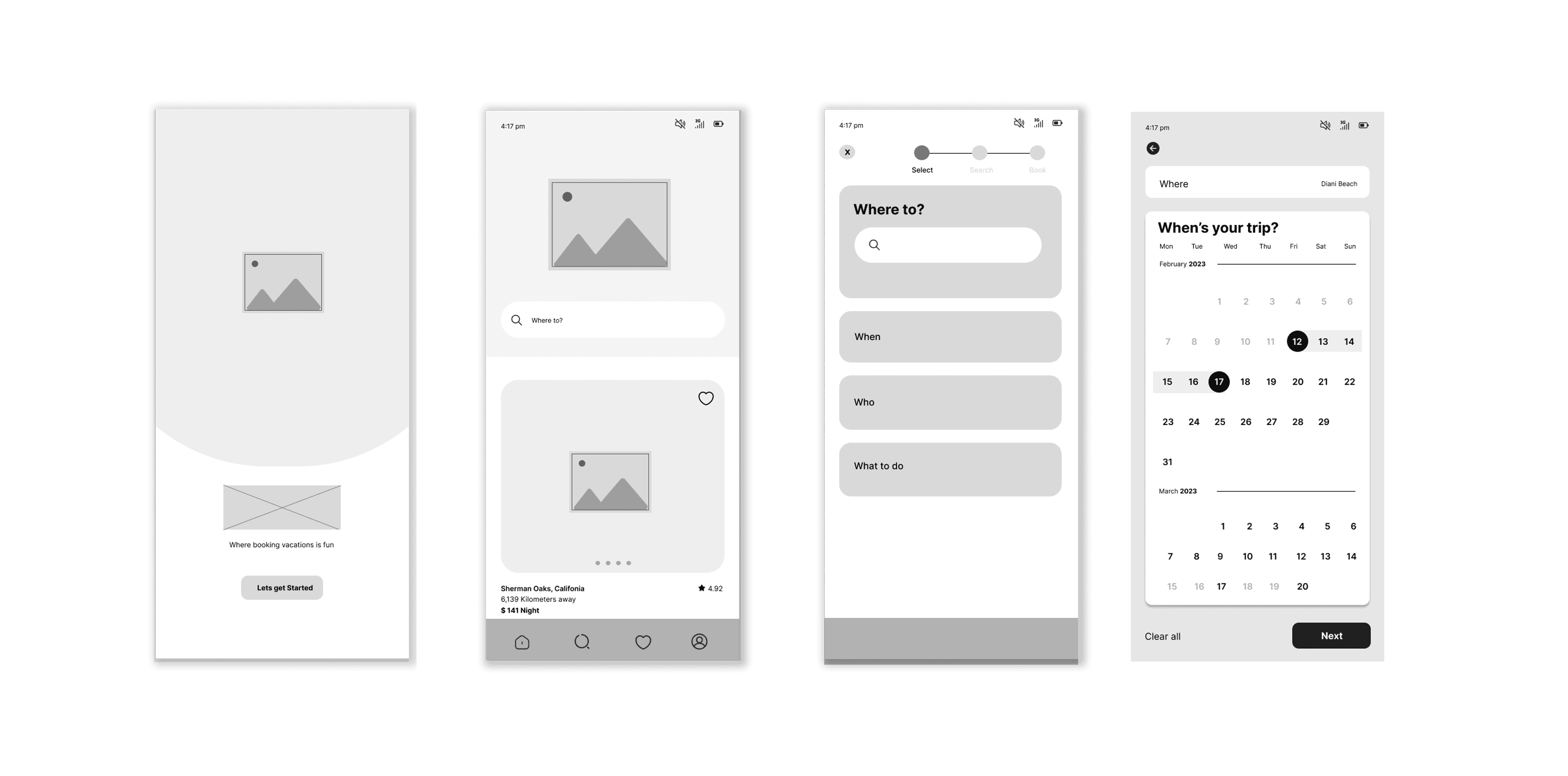
Design Sketch / Low - fidelity Prototype
I first started off with a pencil sketch of my app. I found this extremely helpful as it was the first visual of my app flow. I sketched out what goes where on a screen. It took me by surprise how many of the design ideas I had in mind did not work well, however, this was why I found this stage in particular very helpful because I could make any changes before creating my medium-fidelity prototype


Visual Identity
Visual Identity


Colours
#2B299B
Main Colour
Secondary Colour
#00A2EC
Secondary Colour
#FFAD00
I used Blue because it depicts Trust, Dependability, Authority,
Stability, Strength, Wisdom.
Complimentary Colour
#777777
Complimentary
Colour
#333333
Typography
Typefaces
A
a
Poppins
Google Font
Extra Light
Bold
Inter
Google Font
Light
Regular
Bold
Text Hierarchy
f
Name
Font Weight
Font Size
Heading 1
Bold
24px
Heading 1
Bold
18px
Lead Paragraph
Semi Bold
12px
My Role.
Competitive Benchmark
Note Taking
Usability Testing
Affinity Diagram
Flow Diagram
Wireframe
Prototype
UI Design
Collaborated
with 5 other colleagues for the
Affinity Diagram
Body
Regular
12px
Regular
11px
Body small
Design Phase
Wireframe

Project Overview
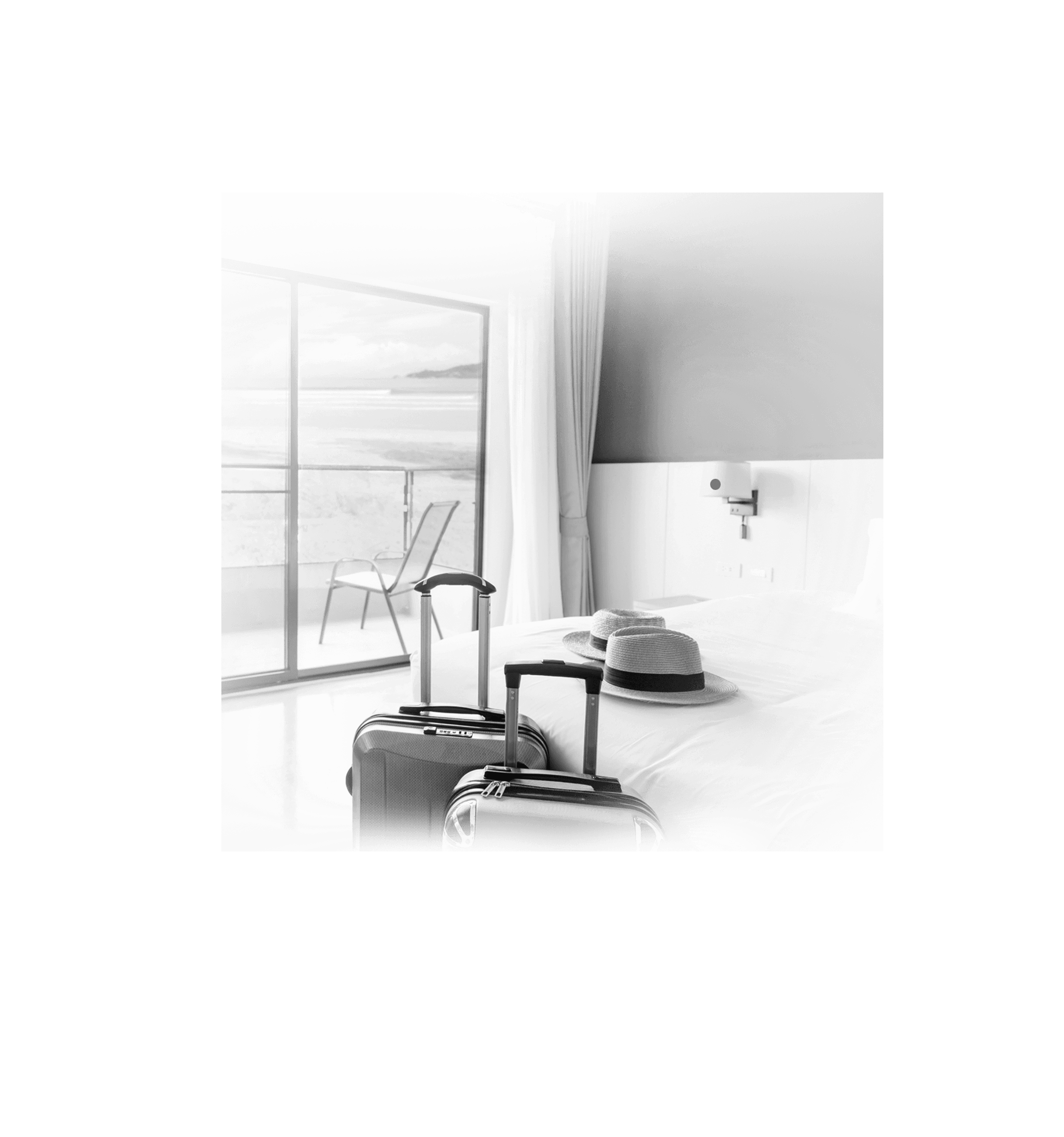
Making travel easy and fun for families means finding ways to make the experience as enjoyable as possible. This can involve finding affordable airfare, hotel deals, and other ways to make traveling more affordable. With Bookily hotel booking app, travelers with kids can find fun and family-friendly events and attractions that are safe while on vacation.
Problem Statement
Families often face difficulty in finding nearby fun activities for their kids when booking a hotel. This can lead to a lack of entertainment options for children, causing dissatisfaction among family members and potentially ruining their vacation experience. This problem is particularly prevalent for families traveling to unfamiliar locations independently without the assistance of a travel agent.
Solution
Bookily is a hotel booking app that specializes in family-friendly accommodations that include features that allow users to search and book for nearby kid-friendly activities and events.
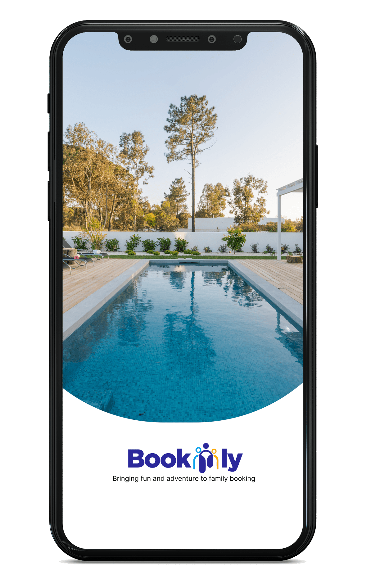
Bookily
A hotel booking app that helps families easily book fun activities while on vacation.
For a quick experience
The main points are highlighted for your convenience

Response Analysis


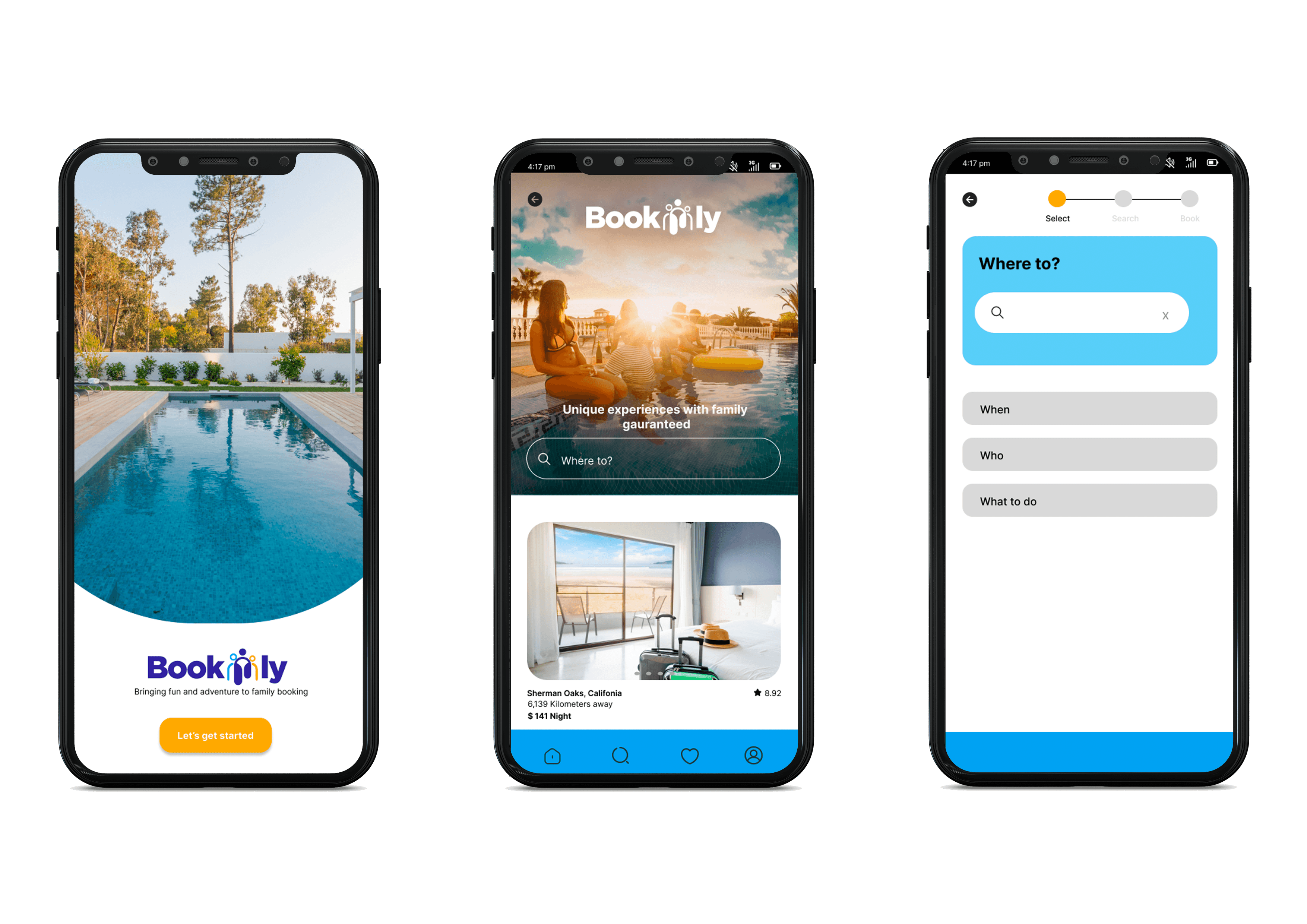
Hi-Fi Design
After submitting my last final projects, I decided to fix up my medium-fidelity prototype and design it with images and the colour palette I had envisioned. Creating a proper version of my app was a great way to see if the colours and layout of the different elements were apparent enough for the user, and visually appealing.
Why a Mobile App
Research shows that Mobile apps are often more convenient for people who are on the go and prefer to make bookings using their mobile devices.
Qualitative Research | Interview
To further understand and empathize with the users, I created two user archetypes based on all the research information gathered from my usability test, user interviews, and an online survey. The archetypes represent the target user groups' goals, behavours, and context of the real design targets.
Wireframing was the last part of this project. Once the design was done, I created wireframes so that I could show what exactly needs to be done on the app. The wireframes needed to be as descriptive as possible so that the app had the appropriate flow as well as the correct response when a user clicks on something.


I used Orange because
it depicts fun, youth,
Happiness warmth
I created a logo, colour palette and chose logos/imagery to suit the tone and feel of my app. It was important to define the brand's visual elements and design system, which should reflect the user experience and the brand's values. The visual identity should be consistent, memorable, and easily recognizable.

Define Phase

Prototype
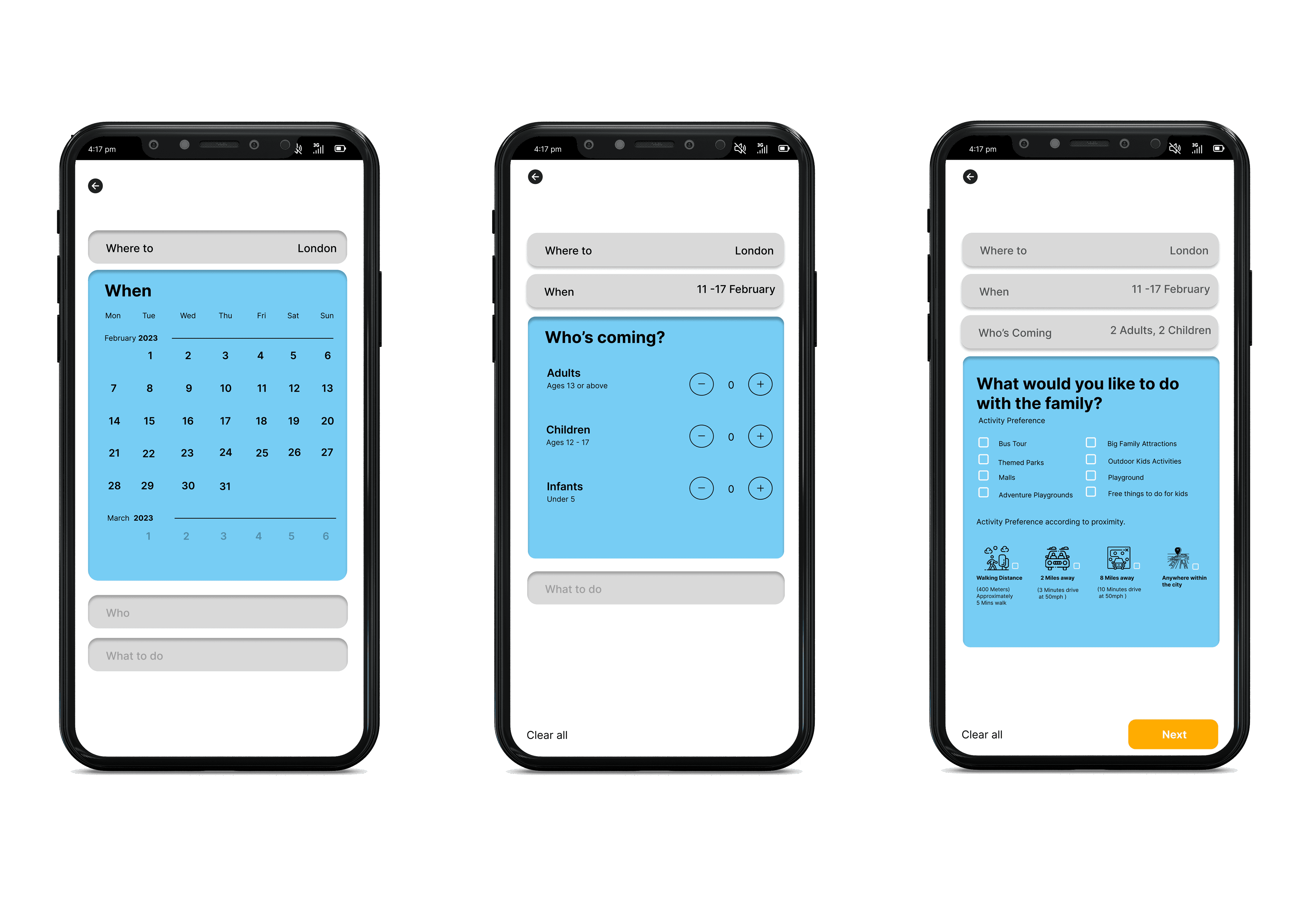
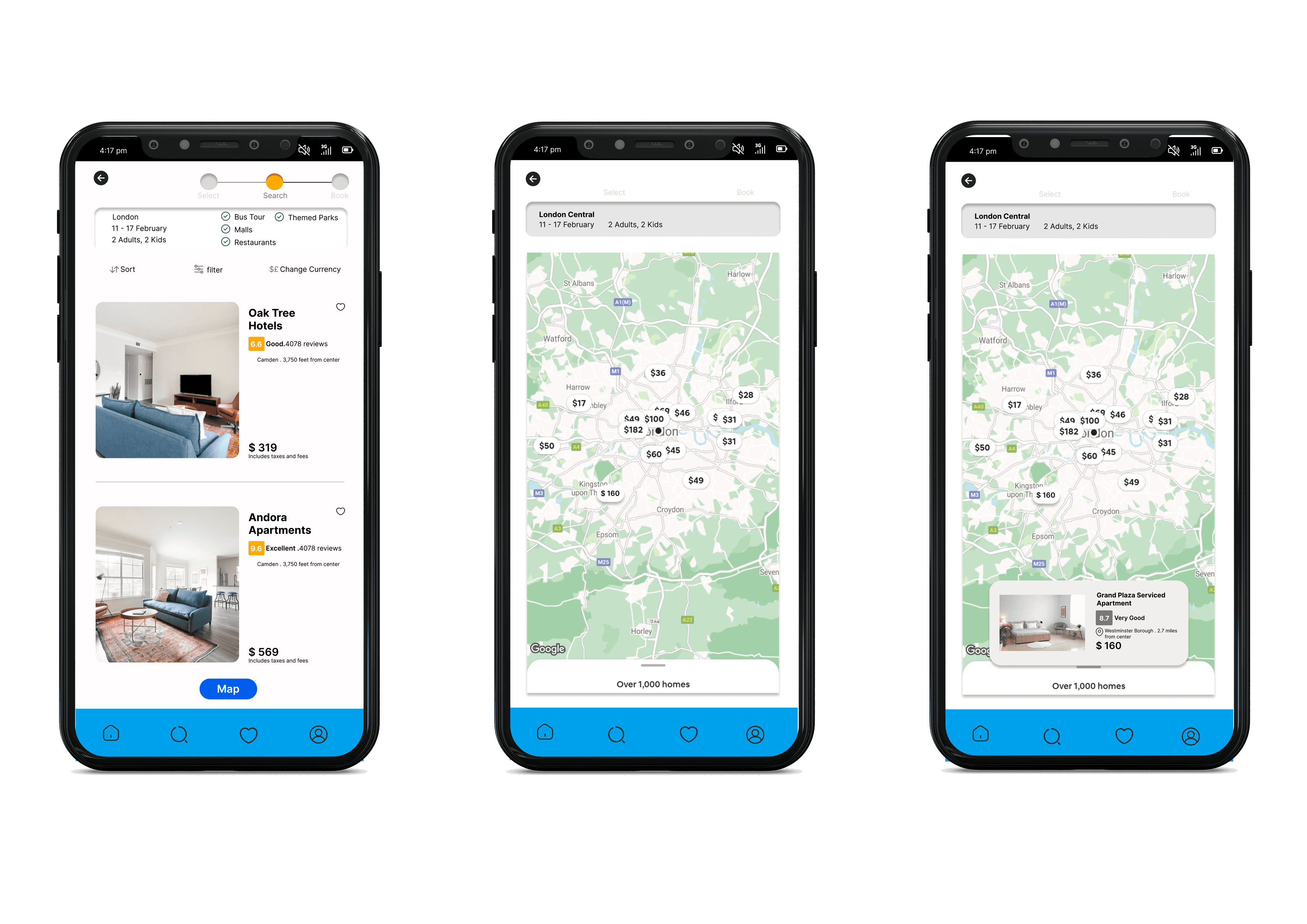
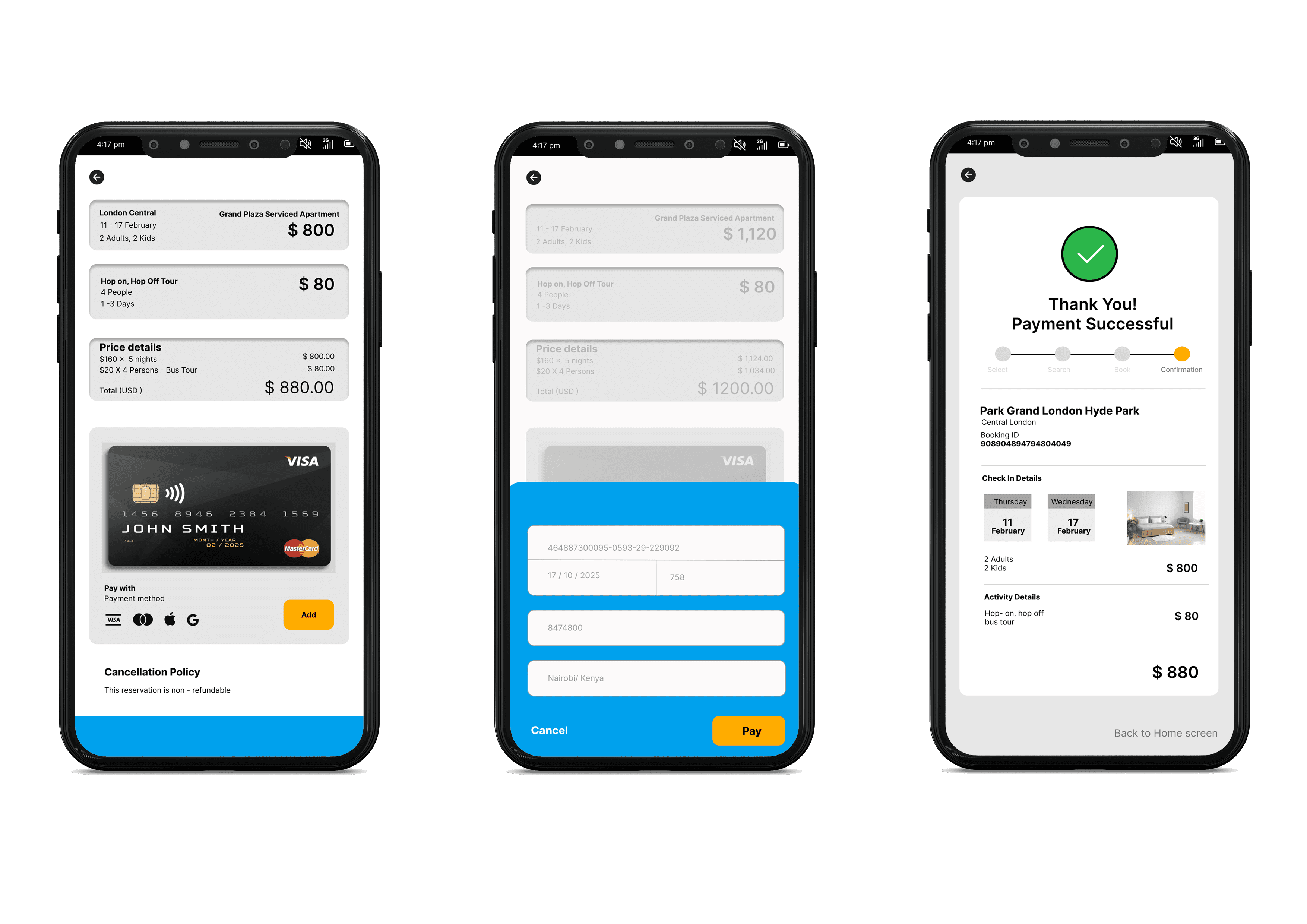
Scenario:
• Travelling to London
• From 11th - 17th February
• 2 adults, 2 Kids
• Family Activity: Bus Tour
• Explore with the map view
• Budget $160
• Check Out
I used the prototype to conduct a test with four users in our target demographic. Participants were able to use the app with ease and happy with the design. There were few positive & negative feedbacks. This helped me uncover opportunities to improve the overall user experience.
User Feedbacks
Testing Phase
Negative Feedback
• Menu should be visible upfront, its difficult to find on go
• I don't like the colours, it's overwhelming me
• I was hoping to see more options for the activities page.
Positive Feedback
• Easy to use so far.
• The welcome page was nice, a bit different from what I see regularly.
• It takes the stress of looking for fun things to do right away.
My Learnings
This course/project has taught me many important and valuable skills when it comes to UX/UI design. It has highlighted the different methods and techniques that are used by UX designers. The journey to creating this app from scratch was challenging but opened my eyes to design trends and functionality.
One of the important lessons I learned was how crucial each step is, whether it is research or prototyping.
Each step has its importance, and should not be skipped. Without all the research, you are not only creating an app with biased opinions but also an app that won’t be solving problems that other users are facing. Doing each step is part of the process of learning and understanding the users, which will then aid in making the right problem-solving decisions.
Another thing I learned and enjoyed discovering was how after each prototype I designed/sketched, I found something to alter every time. For the user flow diagram, I made a basic outline of what is to happen on each screen. However, once I sketched it out, I saw how I needed more CTA’s, or extra screens for the app to flow better. When I created my medium-fidelity prototype, I realized that the layout of each screen needed further adjustment, therefore when I made my final, properly designed prototype, I worked on making those changes. Each stage of this project helped to make my vision clearer and reach my goal - to solve user problems.
Overall, It was a fun yet challenging experience working on this project, also thanks to all the people who agreed to give me their valuable time for my research. I learned about the diversity of opinion which eventually taught me the importance of user research. This course taught me methods that I would be expected to use in a real-life project and where to apply them.